


Colours and scents affect our behaviour and emotions. Following from previous posts on the inter-relationship between colours and aromas, the focus will now be on the colour blue.
The colour of the sky and sea, blue is a universally well liked colour, often mentioned as people's favourite. It is the colour of tranquility, rest and serenity, symbolic of rarity, spirituality, power and trust yet also a colour with shades of coldness and melancholia.
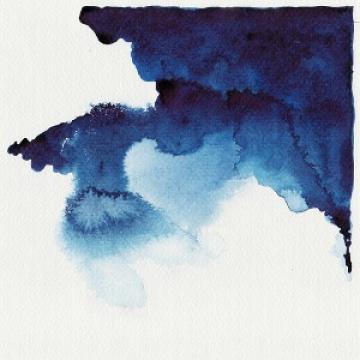
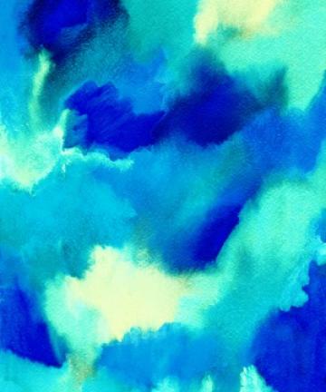
The spectrum of blue colours moves from lighter blues with more white tones such as powder or sky blue to the greenish blues of aquamarine or teal or brilliant blues like ultramarine or cobalt through to blues with further black or grey tones like navy, indigo or midnight blue.
Like the colour green, blue is essentially soothing and relaxing. It has a calming and cooling action on us physically, having the potential to lower heart rate and blood pressure and slow respiration.

What is the meaning or symbolism of the colour blue?
Apart from the ocean and sky, blue doesn't occur all that frequently in nature or food. The colour's association with rarity and preciousness may well stem from this; for many centuries blue was a scarce and coveted pigment used in painting and the decorative arts.
The colour blue was one of the last primary colours to be assigned a generic colour word and is the most neutral in terms of semiotics. Ancient cultures did not have a word for blue, except for the Egyptians, who discovered a way to produce a blue dye for dying cloth and decorative use after the cost of importing lapis lazuli from Afghanistan became prohibitive.

In Ancient Greece colours were largely defined by their lightness or darkness, not hue. Homer's Odyssey describes the sea as "wine-dark", not blue or even green. In Japanese, Thai and Korean languages the same word is used for blue and green. Interestingly, there are different words for light and dark blue in Russian.
In many cultures there are overall positive associations with the colour blue. It is a colour that brings us peace and comfort, evoking optimism and happiness,"blue skies".
Blue has strong marine and nautical associations.
Light blues are generally regarded as calm, peaceful, cool, clean or evocative of water.
Brilliant blues, however, can impart more energy and spirit and have an element of dynamism and briskness to them.
Spiritually speaking, blue is the colour of Krishna in Hinduism, the colour of the Virgin Mary's robes, a colour used in the calligraphy of Islamic mosques and a colour thought to ward off the "evil eye".


In Chinese culture blue corresponds with wood, East and Spring according to the Five Element Theory.
Blue became linked to royalty or "blue bloods" following the habit of King Louis IX, who liked to regularly dress in blue. In Thailand, blue specifically is the colour associated with the Queen.

Conversely blue is a symbol of the working classes, the "blue collar" worker.
Blue correlates to ideas of tradition, loyalty, trust, economic and business security, excellence and high performance. Think of the terms "true blue", "blue chip" or "blue ribbon".
It can also be a colour of power and authority, uniforms and service.
Darker shades of blue are seen as conservative, classic and reliable, having concentrating and introspective qualities.
In Western culture, primarily as a result of marketing after World War Two, blue is seen as a masculine colour, particularly for babies or young children.

Looking at the negative aspects of the colour blue, it can be seen as aloof or distant, the colour of sadness and melancholy, "feeling blue".
In Turkey and Central Asia it is a colour of mourning, in China a sign of torment, ghosts or death.

What does blue smell like?
When we encounter a scent in a particular context, an association with colour, sound, flavour, taste or texture can be formed. This inter-relationship across the senses is what is termed cross-modality.
There are steady and firm associations between colours and scents, both between individuals and over time.
Cultural factors like language and frequent association between objects and smells is a part of this.
Cross-modality is a method we can use to describe scents so that they become part of our shared experience.
Research from a Canadian study looking at colour and texture associations to odours showed that the colour blue was matched significantly with the scents of peppermint(also with green), eucalyptus, then mushroom, slightly less so with the smell of camphene.
I wonder whether the trigeminal and cooling type of effects of peppermint, eucalyptus and camphene led to an association with blue or in the case of the mushroom smell, a link to the mouldy scent of blue cheese?


A study from Gettysburg College, where people were asked to identify a set of odours with strong colour associations, showed a significant association between blue colour and a blueberry odour.
Another paper I found from an Australian study showed the colour blue correlated with the smell of almonds, which is not an obvious association and is possibly explained by procedural factors.
These studies reveal the close connection olfaction has with taste that affects our perception and influences how we describe aromas.
Scent design with blue
Colours and scents can provide a form of communication about a particular space.
Sensory experiences are additive. Merging information from multiple senses increases our experience of an environment.
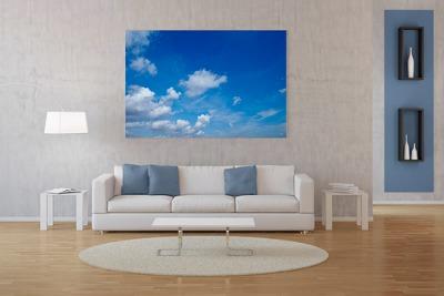
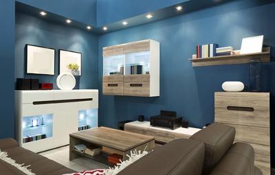
Using blue colours in the living room or bedroom adds softness and conveys feelings of relaxation and composure.
The relationship blue has to water makes it a congruent choice as an accent colour in the bathroom.
Darker hues of blue are best utilised in the study to take advantage of their focusing and clarifying connections.
Lighter blues are good in small spaces to convey a feeling of spaciousness. Blue spectrum light in rooms promotes alertness.
Considering the cultural, semiotic, cross-modal and natural influences of blue, I have given you two examples of essential oil blends you can diffuse in your space that is decorated with shades of blue.
Blend One: Clair
5 parts neroli, 4 parts Himalayan cedarwood, Alpine lavender, 3 parts frankincense (Boswellia sacra), French rosemary, coriander essential oils.
This is a crisp, light blend, imparting a serene and expansive atmosphere to the surroundings. The blend has an eau de cologne feel to it with the neroli, rosemary and lavender, bringing to mind images of cleanliness and freshness.
I would use this in a room either decorated with light or brilliant blues, close to water or used during the Spring or Summer.
Blend Two: Profund
5 parts pomelo, 4 parts Siberian fir, juniperberry, 2 parts carrot seed, Virginia cedarwood,1 part vetiver, benzoin resin essential oils.
I would match this blend with darker, inky blues to enhance their sombre and inward focusing effects. This is a stronger scent compared to Blend One which is consistent with a darker colour scheme.
This composition opens with the sharp, coniferous scents of Siberian fir and juniperberry and citric pomelo evoking a misty, despondent forest in the Winter.
Carrot seed, Virginia cedarwood and vetiver essential oils add texture and density, their earthy aroma grounding and deepening the blend. This corresponds to the ideas of security and reliability that darker blues can represent. Blues are often paired with shades of brown in interior design, so these earthy notes would also be complimentary for such a colour scheme.
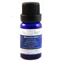
The Scentcillo Greek Island essential oil blend draws inspiration from the vivid, infinite blues of sea and sky in the Mediterranean and the peaceful and restful ambience they convey to their environment.


Further reading
Interior design:
- Winter Garden by Bonnie and Neil. Homewares and soft furnishings inspired by historical conservatory gardens, which brings together deep jewel tones of emerald, indigo and blue. The Design Files.
- Wildland Colours that reflect untamed landscapes from the harshest ice terrains to the wildest forests and mountains. Dulux colour forecast 2015.
- 20 Blue living room design ideas. Homedit.
- How emotions, ideas and senses influence our colour perception. Newsworks.
- No one could see the colour blue until modern times. Business Insider Australia.
- Why blue is the costliest colour. The Guardian.
- Why Is Pink for Girls and Blue for Boys? Live Science.
